Plan your next piece
Lettering tattoos: ideas, placement & planning
The words are only the beginning
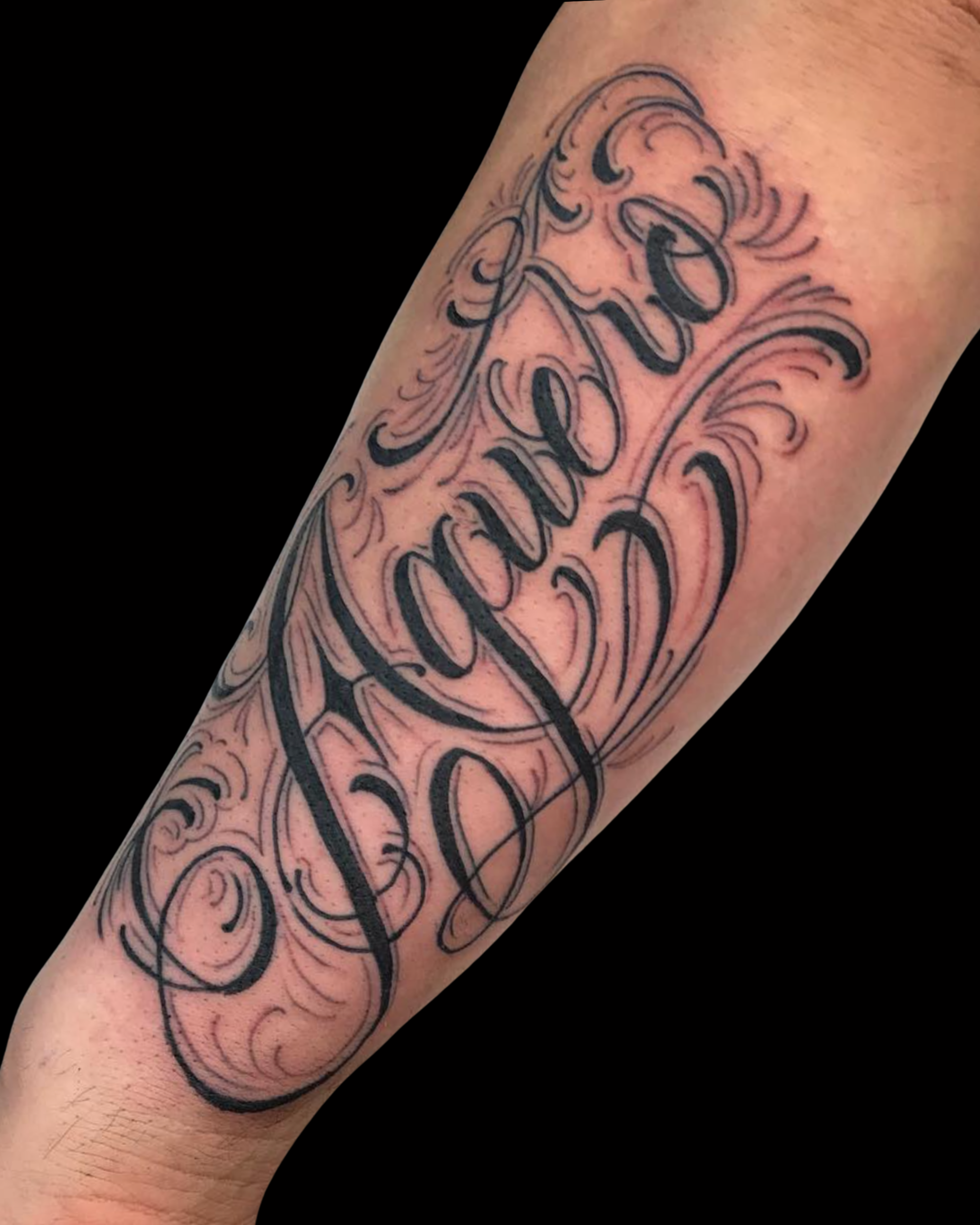
Lettering turns language into a visual composition. A short name in flowing script has a different character from a bold word in blackletter or a handwritten dedication. Before choosing a font, decide what the tattoo should feel like: quiet, formal, expressive or graphic. The amount of text also matters. One word allows different proportions and flourishes than a long quotation, especially when the available area is narrow.
Make readability the design priority
Look at the wording at its intended tattoo size. Pay attention to the open spaces inside letters and the gaps between neighboring strokes. Decorative flourishes should support the word instead of hiding it. If a phrase is too long for the space, consider a larger placement, a simpler treatment or a shorter selection of words. There is no single letter height that works for every alphabet, font and body area; have the artist assess the actual design.
Placement and reading direction matter
Decide how you want the text to be read when your body is relaxed. A name across a forearm, a word on the chest and a vertical arrangement each require different decisions. Bring photos of the placement and any neighboring tattoos so spacing can be planned in context. If you want to reproduce someone’s handwriting, bring a clear original or scan. Explain whether preserving its small irregularities is part of what makes the piece meaningful.
Bring the exact text to your consultation
Check spelling, punctuation, capitalization, dates and line breaks before approving a design. For a language you do not read, obtain a reliable translation and have the exact characters checked by a fluent reader. Start with Chance Ewing’s profile when exploring lettering at Element, or send your idea to the team for an artist match. Compare fine line for a delicate direction and black and grey for shaded inspiration.
Your questions, answered
Can you tattoo handwriting from a note?
Bring a sharp image of the original writing. The artist can assess what can be preserved and what may need more space. Do not compress or heavily filter the image before sending it.
Should I choose a font before booking?
You can bring fonts as references, but you do not need to make the final choice alone. The exact wording and placement help the artist judge which letterforms will work.
Can I fit a long quotation into a small tattoo?
Possibly only by changing the plan. Adding words requires more space or simpler lettering, and shrinking everything can hurt readability. Choose the most important words first and discuss alternatives at the consultation.